Thursday, 24 April 2014
Wednesday, 23 April 2014
Evaluation Question 3: What have you learned from your audience feedback?
Website
Newspaper Advert
Animated Ident Sequence
Tuesday, 22 April 2014
Evaluation Question 2: How effective is the combination of your main product and ancillary texts?
Brand image and continuity is
something I have discussed throughout the course of the project and is
something that is vital to the success of the production.
Website – Newspaper Advert
When looking at the branding
continuity between the poster and the website, the first and most obvious is
the use of the website URL on the newspaper advert. At a base level, this is
combining the two forms of media by literally directing one to the other, no
thematic or imagery based links. Furthermore, the website actually has the
newspaper advert embedded on the page for the show to expand its media. For the
audience visiting the website from the print advert or people identifying the
print advert from the website, this simple technique allows the two pieces of
media to be associated with each other seamlessly.
On top of this is the use of the “Breaking
Point” logo. Found on the website multiple times in the trailer, on the shows
page, and on the main show page. The same logo is found on the print advert
meaning people can then associate the logo with the show across all platforms.
The font choice also is the same as the trailer on the website, giving the show
its own identity spate from the font choice that the website and channel logo
use. Keeping these consistent is an important part of the brand image. Allowing
these things to be identifiable is crucial to the idea of synergy.
Website – Animated Ident Sequence
Although the animated ident
sequence plays a small part in the website, it offers more than just the 2
second sequence to the idea of the brand image. Colours, fonts, and imagery are
all consistent across the sequence and the website style choice meaning it does
not appear out of place. The first consistency is the colour choice; with “Breaking
Point” being advertised as a drama, the red was chosen in the ident as well as
the word “Drama”. This helps the audience immediately understand the genre of
the show. On top of that, that red remains throughout any mention of drama on
the website.
The second similarity is the font
choice, again, the same as the website and logo. Whenever the ident appears,
even without the logo, the style choice and font can help it be identified as
coming from Channel Root, an important feature. Additionally, the logo featured
in the ident is the same as is used on the navigation logo. People can then
begin to associate these 3 features with Channel Root, and not just an aimless
ident sequence.
Animated Ident Sequence – Newspaper Advert
Here, the simple consistency in
colour is enough to show the synergy between two completely different forms of
media. The blacks and reds immediately trigger the feel of drama, and with the
combination of the logo and font style, audience members immediately reacted with
identifying it as Channel Root.
Monday, 21 April 2014
Evaluation Question 1: In what ways does your media product use, develop or challenge forms and conventions of real media products?
Website
With websites, a lot of the conventions
are consistent across all websites in general; things like header navigation,
use of images and video, hyperlinks, and basic interaction. These are all
things I have included in my final production. The top level navigation is
something that you will find on most websites, I developed it from the majority
though by allowing it to stick to the top of the page, remaining in view at all
times, something the ITV website also does.
Use of images and video is
something I have developed from other sites too, with no other sites I looked
at having video on the homepage. My teaser trailer is available on the homepage
without having to navigate to another page, a developed convention from other
TV channel websites. I also use images consistently throughout the homepage and
other pages, a standard in websites especially for TV channel websites.
Hyperlinks for navigation is
another easy convention to employ, and is a must have for websites that users
need to navigate around. I developed this convention on the shows page by
having large images act as the links to the pages, as opposed to just text.
Interaction with elements is
another developed convention. The homepage banner fades out to reveal the video
when the user clicks on watch trailer. The link would usually link to another
page, but having the video come preloaded onto the page means that the user
does not have to wait for a new page to load. A lot of other websites simply
link to another page, starting the loading of assets all over again. In some
ways this actually challenges the convention of having no video on the
homepage.
Animated Ident Sequence
For the animated ident sequence,
I actually decided to have multiple version of the sequence depending on the
genre of show, a developed convention of just having one for all the shows like
HBO.
The sequence still features my
logo, something all sequences conform to. The sequence is branding so not
having the logo at the beginning would be unwise. For the drama intro, I had
chosen deep red and just a soft fade in, keeping in with the serious nature of
the sequence.
Newspaper Advert
Newspaper advertising is a very
common form of advertising and there are a lot of developed codes and
conventions to adhere to. For TV show adverts, it is all about the imagery
created from the main subject of the image. Having looked over many, there were
some key elements that had to be retained. It was important not to hide the
show information, or have it appear cryptically. Clarity about what the show is
called, and where you can get more information is an important convention and
is one that should be kept.
The change to develop and
challenge conventions comes from the use of the image. I opted to choose vector
art as opposed to an actual photograph. Commonly, adverts would show the main
roster of actors in their poster. I challenged this convention by choosing to
not show characters of any kind, just simple but thought provoking image.
Having this was a compromise in terms of being able to capture the image I
wanted in real life, as well as in the end being a more effective image than an
actual photo would have captured.
Friday, 18 April 2014
Thursday, 17 April 2014


Wednesday, 16 April 2014
Tuesday, 15 April 2014
Monday, 14 April 2014

Wednesday, 9 April 2014
Animated Ident Sequence Design Process

Designing the animated ident sequence was had to illustrate, seeing as it was such a fast moving animation. The above picture shows what I had planned for the animation, the text being revealed from the centre of the page, and the logo leaking in. The previews illustrate better what the animation would do, but having it down on paper helped out.
The additional two frames show what I had planned for the sport and comedy. The sport one depicts a ball bouncing on top of the sport text off screen. The comedy one shows a rather comedic occurrence, where the "Y" at the end of comedy tips over and falls.
Tuesday, 8 April 2014
Website Design Process - Breaking Point Show Page
Here is the wireframe design of the page:


The page is actually quite simple, but is dominated by the media for the show. The large trailer and poster make up for most of the space. The page is there to advertise the show and the show alone, so the description and teaser video can all be made for the page. The logo at the top is there to serve as more branding for the show.
Interaction and visual stimulants are the primary focus for this page, with very little to read, it is about directing the user to the media for the show. Being able to identify the logo or the themes in adverts or online is the key to getting them interested in the show to the point where they would watch it.
Below is an example of what the banner at the top would look like with the show logo.

Monday, 7 April 2014
Website Design Process - Shows Page
This is the wireframe design for the shows page.

This page is to list all of the shows currently available on Channel Root. It is a very simple page but has to be interesting so I decided to show the logo for all the TV shows rather than just list them. On top of this, I decided to categorise them based on genre, making it easier to find the show you are looking for.
Here is a look at the logos that will be featured on the final page:

Each show has its own flavor and is distinct.
Friday, 4 April 2014
Website Design Process - Home Page
Below is the hand drawn wireframe version of the website homepage.

The homepage has to encapsulate a lot of information but also must be clear and easy to navigate. The first element on the homepage and every page is the navigation bar or header. In this case, the header sticks to the top of the page even if scrolled down, meaning the user is never far from navigating to a different page.
The next element is the animated banner. This will show information about a featured program, and in my case will also house a trailer for that show. The schedule is also prominent at the top, visible for the user before even scrolling.
After the main banner we find more information about the channel. 3 boxes hold information about 3 different items, distinguished by the colour of the title. Having this information is good for the user as it still condenses the information for the front page, but without sacrificing it entirely.
Below these are a couple of news items. It is important to keep fresh content on the homepage in order to give the user something new to look at every visit. If the content remained the same, users would have no need to even look at the homepage.
Below that is the final element, the footer. This is usually just for small links for the sitemap and the company logo. It also grounds the page and is a visual cue to the user that the page has finished loading.
Here is the page in mockup form:

For the audience, the design is clear and clean but still has plenty of information. The schedule is immediate and up to date, the banner is dynamic and interactive, and the information boxes offer plenty of rich text to read. The darkened header tops the page making it feel grounded.
Thursday, 3 April 2014
Poster Design Process

The basic idea for the poster is to be a teaser for the show "Breaking Point", a drama. A few elements are needed for the poster to be successful. The first is a primary image to look at. This image will get across visually what the show is about and will be used to interest the reader to look at the tagline and information about the show. For this image I have chosen an aerial shot of a cup of tea contrasted against the blood that appears to be oozing from it. Immediately the image feels interesting for the audience and grabs their attention.

The tagline is then what most people will ump on to read. The tagline I have chosen to use is "Just killing some tea time". Again, taking something that people are familiar with, a phrase, and twisting it to make people think about what it might mean. Combining the tagline with the image will almost definitely make the audience think about what the show is about. They would understand the subject matter to be dramatic given the blood and dark tones used in the poster, but still be intrigued as to what the almost cryptic tagline and striking image mean for the synopsis.

Below all of that is the information about when the show is on, the name of the show and the channel it is on. This is vital to make sure the audience know where to go to look for more information, including the website.
Tuesday, 1 April 2014
Friday, 28 March 2014
Ident Previews


Today I began to visualise what the ident might look like in its completed form. The above animations are short ideas I played with. The first one would be for drama shows and and bottom one for sports shows. They turned out pretty well I feel, and I look forward to expanding on the concepts and seeing them on the website introducing my short clips.
Wednesday, 26 March 2014
Synergy in Production Work


Across all my production work, I hope to maintain a certain synergy that will help develop a brand image. To do so, I will need to adhere to some standards when it comes to branding my production. This expands from suing consistent typefaces, colours, and imagery throughout.
Above are 2 posters for the ITV series Injustice. From just a glance, you can tell that both of the posters are from the same show. Simple similarities include the placement of the information about the show, consistent font and colour choices, as well as the very obvious similarity in the image chosen. Both being black and white, and both having a silhouette effect.
In terms of effectiveness, these posters actually respond well to my target audience. The simple imagery, bold colours, large text, interesting image; all these elements are important to my target audience and I can see my final product looking similar. Something I will go into in the evaluation is the ties between the website and the poster, but for now it important to note that I plan on using similar techniques to the images above. Use of font, style, and theme should all remain consistent throughtout the products.
Tuesday, 25 March 2014
Designing the Logo Mockups Part 2
After designing the Root symbol, it was time to design the text around it. I chose Robot as the font, and opted for the condensed bold variation.

Having selected a font, colours were the next design choice. I opted for an orange colour for the base colour. It was the most neutral colour and didn't clash with any of the genre specific colours. After selecting the colours for each genre, it was a simple task to change the colours of the Root symbol, matching the colour of the text.
Monday, 24 March 2014
Designing the Logo Mockups Part 1
To create the logos in the mockup last week I used Photoshop combined with Illustrator.
Illustrator
Illustrator was used to create the Root symbol that appears on the designs. The important thing about the root symbol is that, like the text, it must be in a vector format. That is when you resize it, it retains quality. Below is an example of what happens if you resize the logo without the vector symbol:

Compared to when you use the vector version:

This is an important aspect of commercial branding. Having your logo look good at all sizes is important for brand quality.
Friday, 21 March 2014
Final Logo Mockups
In the end, I settled on a logo that clearly integrated the root symbol, rather than one that just had it tacked on. This would keep the logo small and compact when used in promotional media. Here is a final mockup of the logo in various forms.

Wednesday, 19 March 2014
Logo Designs
One obviously important part of my TV station's image is its logo. After settling on the name "Channel Root" I tried to think of something that could symbolise the "root" while still remaining simplistic and easily identifiable like the focus group had requested.
The use of actual plant roots was considered but focus groups found the randomness not very identifiable and clear. It was apparent that I needed a simpler image or icon to choose.
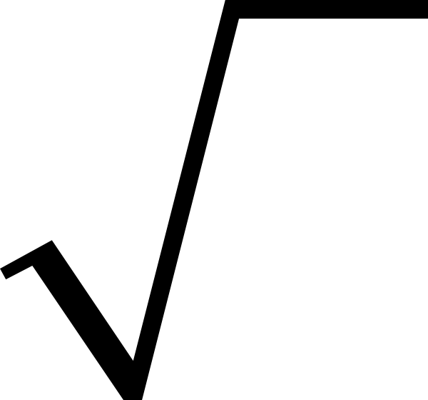
That is where the square root symbol came in. It had the potential and simplistic aspects that I was looking for. On its own, it could still be easily identified, meaning no matter what situation the logo was in (i.e. black and white, colour, small, large, transparent) it could still retain its form, symbolism, and identity.
I then drew up some loose variations using the symbol. I tried playing with composition of the logo and the text, colours, and the actual logo itself.

Monday, 17 March 2014
Website and Newspaper Advert Survey - Newspaper Advert - Results & Analysis


What did I learn?
Designing the newspaper advert would require the use of certain conventions, but knowing which ones respond effectively to my target audience would help better mold the design into an effective piece of production.
As with any poster, a large image is en expectation, or at least the absence of any large bodies of text. The advert needs to be fast acting; the audience member will likely not want to sit around for 5 minutes reading reams of text. Having a large image and little text is key to getting the audience member interested in taking the time to look at what is being promoted.
The other important part about this image is that it has to be interesting or thought provoking. If the image is dull or boring, the audience will not be interested in reading about it. However, an interesting image could grab the attention of the audience, causing them to think and read on in the advert. Having this image is crucial to grabbing the audience's attention and is key to the promotion's success.
Large text and bold colours are also important. The audience will likely only get a glance at the advert when reading the paper so having clear and striking text will be important to get the audience the information it needs. If the show title and information was small or hard to read, nobody would be interested in taking the time figuring it out. Clear text will make it impossible for the audience member not to read the information about the show.
Bright colours and fun fonts were not well received by my target audience, so I think I will still to clean fonts and keep a reasonably well grounded colour palette. Simple imagery is something I hope to use however, as a way of getting across a striking image.
Friday, 14 March 2014
Website and Newspaper Advert Survey - Website Information - Results & Analysis


What I Learnt
This section was to garner some more general feedback about what information people look for on a TV channel website.
Right off the bat, it is clear that people in general prefer lighter and brighter colours as opposed to darker blacks and greys. With this information I can tailor my website to include these lighter tones much more predominantly.
The next question is about the use of images and video. Overwhelmingly, these multimedia elements are very important to the majority of users, with a minority not rating it as very important. In my website, images and video will be featured at the forefront and will dominate the content of the pages.
The final question in this section is about what people expect to find on TV channel websites. Most importantly, nearly everyone in the survey said large images and video. It is clear that these will have to be a focus when making the website. A large majority also expect a schedule of some kind, which would be good to include. News is a feature which a good few also thought would be important to include but not a lot at all really thought social networking is expected, so I decided to leave it out of my designs.
Thursday, 13 March 2014
Website and Newspaper Advert Survey - Channel 5 - Results


What did I learn?
In general, the Channel 5 website scored lower than ITV but I could still learn from the mistakes of the Channel 5 website.
The use of images was rated adequately. In general, images were too small which meant that they were hard to discern. People in general thought the images could be bigger which is something I hope to do for my designs.
Text and font was divided in rating. In general, people were happy with the size and font type, but the dark background on light text meant it was hard to read. If the colours were inverted the rating would have increased, something my designs will hopefully reflect.
Colour use was rated extremely poorly for the site, with users not responding well to the blacks and greys, combined with the text especially. Something which I will definitely change for my designs is the use of dark colours in exchange of lighter colours.
However, if there was something that Channel 5 did excel at was content. People responded well to the use of the schedule, something I hope to include in my design. Additionally the use of the banner information is something people found to be extremely useful, and is something I hope to include.
Tuesday, 11 March 2014
Website and Newspaper Advert Survey - ITV Website - Results & Analysis


What did I learn?
The first question is just an overall rating, with ITV scoring on average an 8/10. I then divided up the opinions into separate elements to better understand the reasoning behind the score given, as well as take the best elements of the site and use them in my own one.
The first was the use of images and ITV scored pretty highly in general. Speaking to people who took the survey, the main cause for concern was the use of the large images at the top which people found distracting. On the whole however, people thought the scale and use of images was pretty good.
The use of text and font was scored very highly, people saying that it was easy to read and clear. I hope to employ the same use of fonts and text in my design, sans-serif and clean.
Colour was also rated highly, people responding well to the light and vibrant accent colours. With much of the page ebing white, people were able to focus and read text much easier than when it was dark. This is something I plan on using in my website.
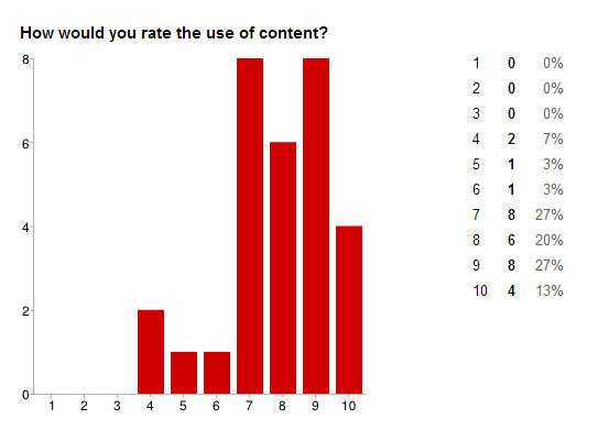
The last was the use of content. This is where ITV slip up and lose marks, scoring very low. The content simply wasn't there on the most part.Very few images, no schedule, no video, little text to read. This is something I hope to rectify on my website, by effectively using content to keep the user interested.
Monday, 10 March 2014
Friday, 7 March 2014
TV Channel Name Ideas
One of the toughest tasks so far has been to decide on a name for the TV channel. Various names have been thrown around including:
- Buzz TV
- TopHat TV
- The Deep Channel

All of the ideas could have worked but it was "Channel Root" that I enjoyed the most.
Firstly I liked that it was short, just "Root" on its own could be identifiable. I also liked the connotations of the word root. It is often used to mean raw, basic, grounded. It had a nice feel to say "TV, back to its roots".
After settling in on the name, it was time to design a logo around it.
Thursday, 6 March 2014
Newspaper Advert Analysis
Newspaper adverts are an
effective way of promoting products, but for TV, this medium can be challenging
to get right. With TV so reliant on sound and motion, newspapers would seem
like a poor medium to properly convey what television is all about.
The first advert is a Channel 4
advert for “Race & Intelligence: Science’s Last Taboo”. The first aspect of the
advert that draws the audience in is the large striking image. Seeing as TV is
primarily image based, it makes sense for the bulk of the advertisement to be
taken up by the image. In this case, the picture depicts an altered image of
what at first glance looks like an unknown speaker, but after a longer look, is
revealed to be Barack Obama. This is a particularly effective advert due to the
fact that the image changes as the audience watch it, much like TV itself. Channel
4 has almost made the still image become animated. Not only does this pique the
interest of the audience but poses questions, like why the image is manipulated
in this way.
The second convention of the advert is the Channel 4 logo. Situated clear so the audience can see it, it informs them of simply where the show is available to watch. Without this clear indication, the audience is left stranded without knowledge of where the show can be watched. The easily recognised Channel 4 logo is enough for the audience to understand where they can watch the programme.
The second convention of the advert is the Channel 4 logo. Situated clear so the audience can see it, it informs them of simply where the show is available to watch. Without this clear indication, the audience is left stranded without knowledge of where the show can be watched. The easily recognised Channel 4 logo is enough for the audience to understand where they can watch the programme.
The final aspect is the title
of the show and when it is. Two very important pieces of information that is
essential for the audience in order to be able to view the actual show. The
text is contrasted on the block white background to ensure that the text is
visible. Otherwise, the colour of the text could be hard to read on the multi-coloured
image as seen below.
Rollover The Image to Compare

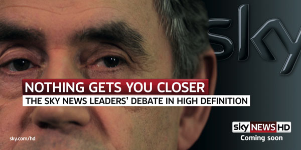
The second advert is for Sky News, advertising the Leader's Debate. Again, the same three conventions are utilised to advertise the programme.
The first thing the audience sees is a large image of Gordon Brown's eyes. In fact, the eyes are the only part of the face you can see in the advert. This plays well into the line "Nothing Gets You Closer". A curious audience will be interested in finding out why only his eyes are shown rather than a full face, much like the Channel 4 advert. This simple choice already draws in the audience despite no text or audio cue.
The Sky and Sky News logo again is displayed clearly so the audience is aware of where the programme can be watched.
The programme being advertised in this case is the Leader's Debate. Like the Channel 4 advertisement and most print adverts the text has a block colour background in order to clarify the text.
Wednesday, 5 March 2014
Website Analysis
Channel 5

The Channel 5 website tries to pack as much information onto the page as possible. The user is greeted with what is currently on the channel, news about the channel, access to its on demand service, a Twitter feed, all without scrolling. As impressive as the information is, it can get a little cluttered and feel claustrophobic. The user isn't really introduced to anything striking, and with so much to look at, the user can get lost quickly.
In terms of visual appeal, the dark colour scheme used is easy on the eyes, and fonts are used consistently where needed and is embellished to draw the eye and offer clear distinctions between sections. With these deep tones, you get the idea that Channel 5 is centred on drama. No bright or vibrant colours are used which would usually be indicative of a comedic tone. Neither are any rich informative tones like blue or green used, which would give the feeling of documentary focused TV. Instead, dark blacks and greys dominate the page, giving a serious vibe to the site.
The use of the large slider that cycle through the channel’s TV shows is a good idea, giving the user a look at the channel’s offering and giving the channel a chance to offer up dramatic visuals, like the explosive look at Home and Away in the picture analysis.
ITV

ITV is a starkly different website to the Channel 5 site.
Where Channel 5 prominently features as much information as possible, the ITV site would be regarded as minimalistic. Practically no information is immediately given to the user about the channel. No schedule, no news, no social media. What does feature in a rather impactful way is the images above the navigation. It is impossible not to see them, which is exactly what they are there to do.
The visuals of the website are much lighter than the Channel 5 site. Although text is not featured prominently, it is used cleanly and consistently. The lighter look also implies a slightly less dramatic TV roster. The images used too also coincide with this idea. Non action based shots like food don’t exactly invoke excitement in the user, but that is not the speed that ITV are going for. Light hearted tones, simple images and clean text all create a sense of nondramatic based television.
There are a lot of conventions that I will be looking to include in the production of my own work. The first is the use of images to liven up the page. Both these and many other TV channel websites use a lot of images to give vibrancy to the page. Given the TV is a very interesting and visual medium, it is important to include these wherever possible.
The next convention I plan on using is video. Given that TV is an animated medium, it would be unwise to have a completely static webpage. Having a teaser trailer is important to give the user some kind of audio or motion feedback, especially since the website is all about the TV shows.
There are some more general conventions of websites that I will have to adhere to also. Using suitable font sizes and variation of font to suit context is important. Large bold titles, compared to smaller thinner bodies of text. Navigation that is clear and easy to use, rather than hidden and complex. Use of hyperlinks to navigate the pages on the site as well will be crucial.
Codes and Conventions of TV Websites
The next convention I plan on using is video. Given that TV is an animated medium, it would be unwise to have a completely static webpage. Having a teaser trailer is important to give the user some kind of audio or motion feedback, especially since the website is all about the TV shows.
There are some more general conventions of websites that I will have to adhere to also. Using suitable font sizes and variation of font to suit context is important. Large bold titles, compared to smaller thinner bodies of text. Navigation that is clear and easy to use, rather than hidden and complex. Use of hyperlinks to navigate the pages on the site as well will be crucial.
Monday, 3 March 2014
Audience Profile
Below is the audience profile for
my TV channel programming.
“I am a 27 year old, male,
confident and intellectual. I like watching hour long dramas rather than 20
minute sitcoms. I don’t have a lot of time for TV so when I do watch it I tend
to go for critically acclaimed shows. I like to discuss TV shows with my partner,
but not really online. If friends also watch it, we might catch up at some
point. I am well paid and can afford to go watch movies often, again going for
high rated thrillers and dramas rather than summer blockbuster recycles. Not to
say I don’t still find comedies funny, I just would rather spend my time
watching dramas than comedies. With more time, well written and smart comedies
would be right up my street. I am also tech savvy, buying into the latest in
technology, owning a tablet and a large TV.”
This is the type of audience that
my production work is aimed at.
Saturday, 1 March 2014
The Chosen Brief
The brief I have chosen to fulfil is the following:
“A website for a new TV channel (to include a minimum of three hyperlinked pages with original images, audio and video extract) together with the following sub tasks:
- A newspaper advertisement for the channel
- An animated ident sequence for the channel“

Having previous experience with building websites and thriving on creating new brand concepts, the brief really appealed to my talents. Almost immediately I could see ideas to take the project, and was excited to see where the product would end up.
Websites are obviously a crucial part of any modern company. It is usually the first stop for information of any kind regarding the brand, able to dynamically update content to provide up to the second data. Being such an important part of the brand image, it is essential that is looks, feels and navigates well for the user. Being able to show a range of media on the site is also imperative. The web platform is able to offer audio, video, text, interaction, all on the same page. Using all of the tools at my disposal will be vital to the success of the website. I will be sure to look at existing TV channel websites to see how they have used all the media types, and see if I can match the level of interaction they have.

Newspaper advertisements are still an extremely effective way of getting to your target audience. Although they do not have interaction of any kind or even audio, they still are an excellent way to get brand ideas across in very small spaces and limited time. They have to be clever and fast acting in order to be successful. It is difficult for TV to come across alive on paper, so I will have to look at other adverts to see what kinds of techniques are used. Beyond that, some out of the box thinking will likely be required.

Animated idents may not seem important or will be overlooked by most, but they are the way the TV channel brands their products. In that respect, they are as important as product labels at supermarkets. They provide a way to associate quality with the product shown, so having an ident that is memorable, right in length and engaging is actually one of the most important aspects of a TV channel.

In order to successfully complete all of these tasks, I will need a lot of resources.
For the channel initially, I plan on having dramatic programming primarily. Similar channels would be HBO in that the shows are very tailor made and high quality. Each series is carefully constructed rather than picked off a pilot pile.
Subscribe to:
Comments (Atom)