


What did I learn?
In general, the Channel 5 website scored lower than ITV but I could still learn from the mistakes of the Channel 5 website.
The use of images was rated adequately. In general, images were too small which meant that they were hard to discern. People in general thought the images could be bigger which is something I hope to do for my designs.
Text and font was divided in rating. In general, people were happy with the size and font type, but the dark background on light text meant it was hard to read. If the colours were inverted the rating would have increased, something my designs will hopefully reflect.
Colour use was rated extremely poorly for the site, with users not responding well to the blacks and greys, combined with the text especially. Something which I will definitely change for my designs is the use of dark colours in exchange of lighter colours.
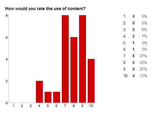
However, if there was something that Channel 5 did excel at was content. People responded well to the use of the schedule, something I hope to include in my design. Additionally the use of the banner information is something people found to be extremely useful, and is something I hope to include.
No comments:
Post a Comment