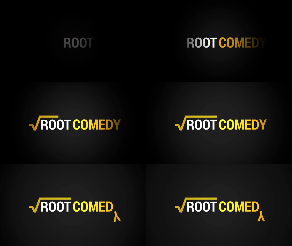
Today I began to visualise what the ident might look like in its completed form. The above animations are short ideas I played with. The first one would be for drama shows and and bottom one for sports shows. They turned out pretty well I feel, and I look forward to expanding on the concepts and seeing them on the website introducing my short clips.
Friday, 28 March 2014
Wednesday, 26 March 2014
Synergy in Production Work
Across all my production work, I hope to maintain a certain synergy that will help develop a brand image. To do so, I will need to adhere to some standards when it comes to branding my production. This expands from suing consistent typefaces, colours, and imagery throughout.
Above are 2 posters for the ITV series Injustice. From just a glance, you can tell that both of the posters are from the same show. Simple similarities include the placement of the information about the show, consistent font and colour choices, as well as the very obvious similarity in the image chosen. Both being black and white, and both having a silhouette effect.
In terms of effectiveness, these posters actually respond well to my target audience. The simple imagery, bold colours, large text, interesting image; all these elements are important to my target audience and I can see my final product looking similar. Something I will go into in the evaluation is the ties between the website and the poster, but for now it important to note that I plan on using similar techniques to the images above. Use of font, style, and theme should all remain consistent throughtout the products.
Tuesday, 25 March 2014
Designing the Logo Mockups Part 2
After designing the Root symbol, it was time to design the text around it. I chose Robot as the font, and opted for the condensed bold variation.
Having selected a font, colours were the next design choice. I opted for an orange colour for the base colour. It was the most neutral colour and didn't clash with any of the genre specific colours. After selecting the colours for each genre, it was a simple task to change the colours of the Root symbol, matching the colour of the text.
Monday, 24 March 2014
Designing the Logo Mockups Part 1
To create the logos in the mockup last week I used Photoshop combined with Illustrator.
Illustrator
Illustrator was used to create the Root symbol that appears on the designs. The important thing about the root symbol is that, like the text, it must be in a vector format. That is when you resize it, it retains quality. Below is an example of what happens if you resize the logo without the vector symbol:
Compared to when you use the vector version:
This is an important aspect of commercial branding. Having your logo look good at all sizes is important for brand quality.
Friday, 21 March 2014
Final Logo Mockups
In the end, I settled on a logo that clearly integrated the root symbol, rather than one that just had it tacked on. This would keep the logo small and compact when used in promotional media. Here is a final mockup of the logo in various forms.
Wednesday, 19 March 2014
Logo Designs
One obviously important part of my TV station's image is its logo. After settling on the name "Channel Root" I tried to think of something that could symbolise the "root" while still remaining simplistic and easily identifiable like the focus group had requested.
The use of actual plant roots was considered but focus groups found the randomness not very identifiable and clear. It was apparent that I needed a simpler image or icon to choose.
That is where the square root symbol came in. It had the potential and simplistic aspects that I was looking for. On its own, it could still be easily identified, meaning no matter what situation the logo was in (i.e. black and white, colour, small, large, transparent) it could still retain its form, symbolism, and identity.
I then drew up some loose variations using the symbol. I tried playing with composition of the logo and the text, colours, and the actual logo itself.
Subscribe to:
Posts (Atom)


